I know it’s a first world problem, but being an author comes with the responsibility of an ‘author photo’. I love being behind the lens of a camera, but don’t enjoy being in front of it. However, with Return To Roseglen only weeks away from release, I needed to update my photo. Capt G assured me people wouldn’t recognise me at any of the reader events if I kept using the photo from the magazine article in the Cairns Profile back in 2012. He may have a point… Charlotte Rose did take some wonderful shots, but sometime in the last 6 years I’ve developed laugh lines, or something similar, and silver in my hair!
Luckily for me Kathy Mexted is a friend who’s talented with a camera and lives outside of Melbourne. She was kind enough to invite us to stay with her and her family for a couple of nights. By the time I left, after having a lovely time exploring the district with her and talking writing and photography, I was spoilt for choice with so many lovely photos. But then comes the tough decision. Which one to use??
I’ve decided to use all of them. Which one do you prefer?
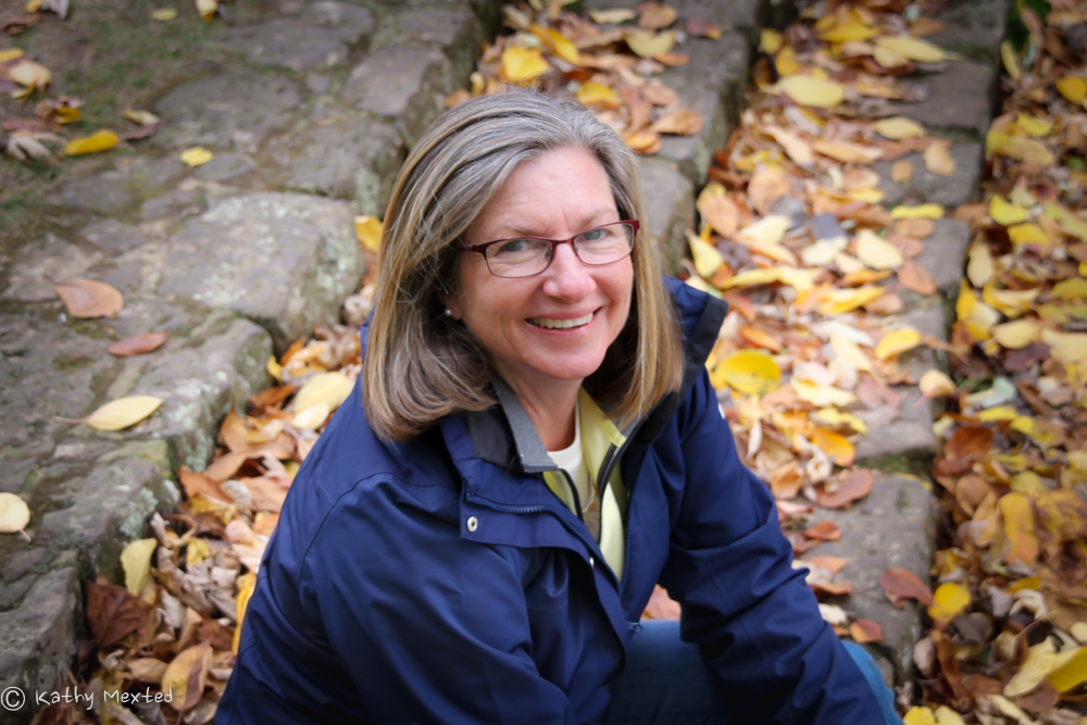


for me? I rather like the top ‘autumn leaves’ for places like profile pics for your social media outlets. It’ll crop nicely for the different specs the different outlets.
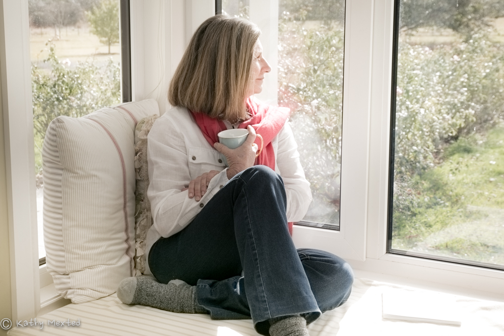
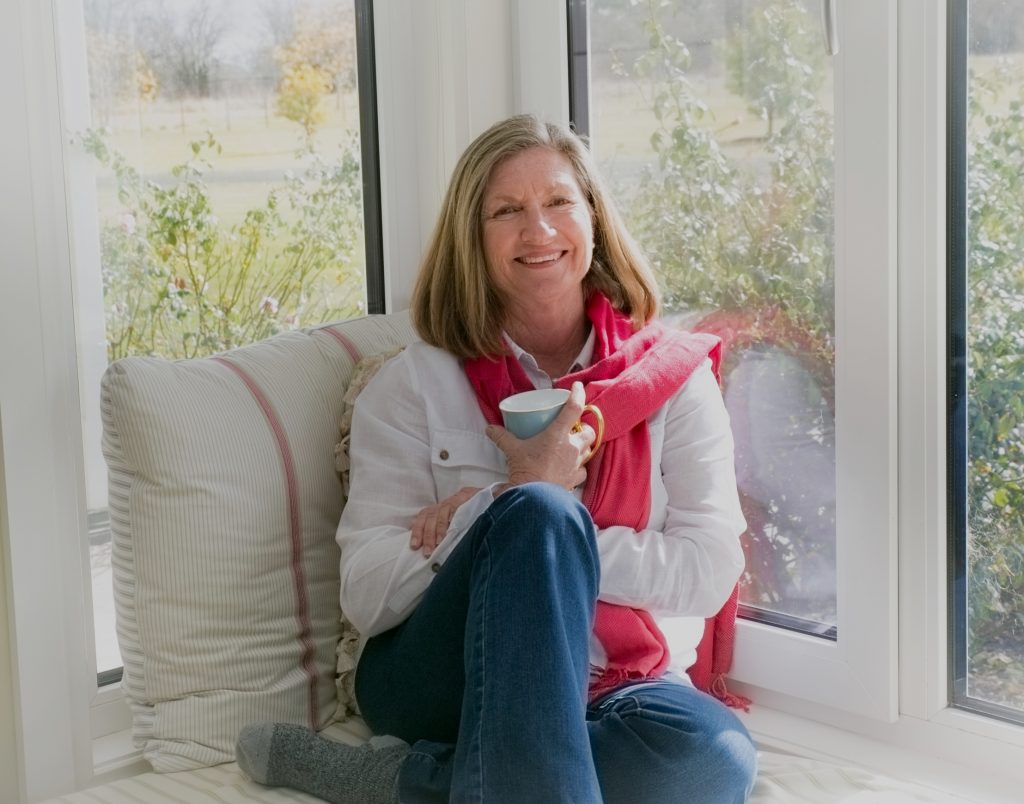
I like the ‘view out the window’ shot for the about me page in your website…
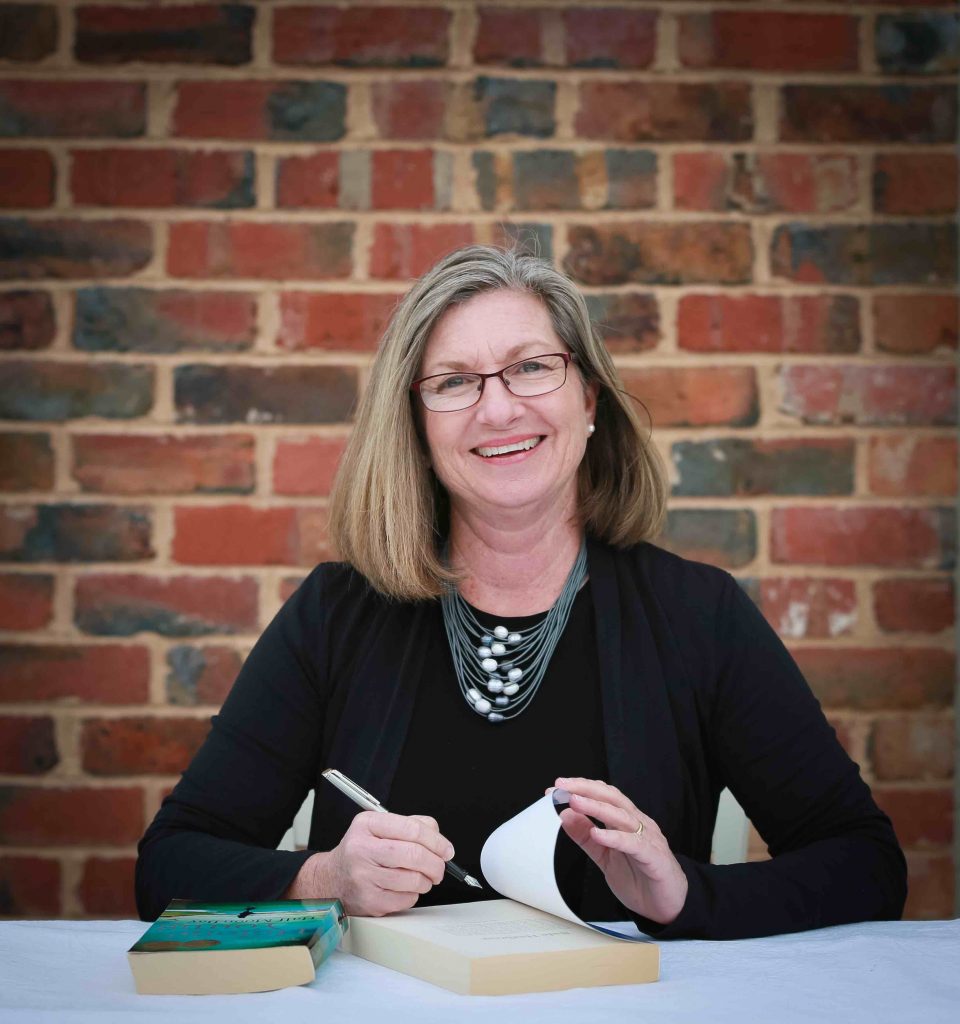
The signing one is, I think, great for submitting to media outlets for appearances on podcasts, library talks … the sort of thing where they’d want to do a post on social media or flyer advertising that you’ll be in interview/in appearance. Same goes for the next one down (cosy coffee cup curl up one looking to camera). The signing is more ‘formal’ and some outlets kind of are too… but the cosy coffee cup is very likeable and just gives choice in relation to the mood of the outlet (not to mention to the person making up the post/graphic/promo/flyer).
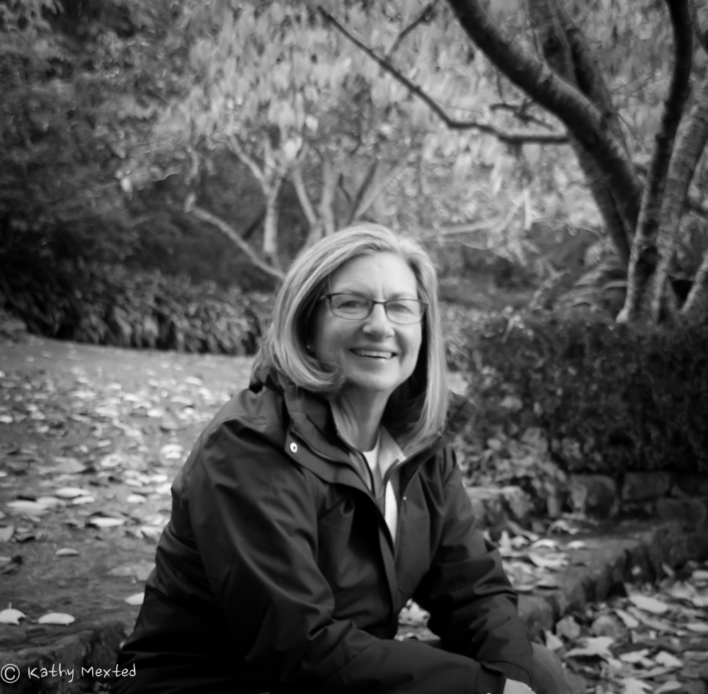
Like the B and W on the second one more than the first one and reckon you could get away with it in the “instructor” sense for a workshop – but in a very familiar place… if you were say speaking at a major conference as a keynote, I’d us the signing or the cozy coffee cup curl up).
I reckon your photographer has done a cracking job capturing the facets of “Helene’s” well done to them with copious chocolates offered in their direction.
(Just my humble, well meant two cents)
They are all lovely, but the second last one with you in a white shirt and red scarf I thought looked very elegant.
Thanks, Cheryl ann, I think that one is the winner for the webpage at least! I loved both the photos in that sequence. I think Kathy caught my mood beautifully 🙂
Helene, I like the 3rd photo of you sitting looking out the window– very much an author’s space of writing in an enclosed space, looking out into the world outside.
Thanks, Bhama, it was so lovely snuggling on that window box. I think I could write in that wonderful house very easily!
Hello Helene. All the photos are good but I prefer the top one. Looking forward to the new book. Keep on enjoying your trip. Cheers Vanda Carter
Thanks, Vanda, the first one is definitely me in my happy place out doors – I think I’ll have to find a home for all of them!
As with all of the above. SO hard to choose. I like the bottom three but thinking the book signing is most appropriate but the last wild one is a stunner. I do love the looking out the window. Promotes thought and wonderment.
I’m not much help for your decision making.
Love Caro x
I’m grateful, Carolyn, that Kathy took such lovely photos that I have a choice! I may just have to use all of them!
Hi Helene,
They are all fantastic photos, but as the objective is to feature a selected photo on one of your books, you could not go wrong with that study of you signing a book. Second choice, the one below in sequence, so colourful and relaxed
Thanks, Garry, appreciate that. I think I may have to use specific ones for specific occasions! Kathy made the task of being in front of the camera a whole lot easier than it usually is 🙂
I love them all. The ones with you in the window are beautifully relaxed and ‘you’ – definitely website worthy. Officially, the one with you signing the book or the last one with that lovely smile 🙂 Of those two, the last one is my favourite.
Thanks, Juanita, I think you’re right and the photos will fit different platforms. It was clever of Kathy do try so many different settings for me 🙂 And by the end I was totally relaxed.
I love the first one, but for your brand, the second last with the cup, or the third last signing a book.
Thanks, Susan. The photo with the cup, and the one looking out the window, were the last ones taken and I felt relaxed by then!
Helene, oh dear!!
I love them all but the one with the cup is especially relaxed & lovely.
As a fellow photographer, it really speaks to me!!!! Your real essence “shines through”!!
Warm regards,
Rhonda (fr AWPA)
Thanks, Rhonda, Kathy had me totally relaxed by then and I could have stayed in that window seat to read the day away 🙂
They are all lovely but for the.book cover I love the second last one.
Thanks, Kathy, I love the one too. I felt relaxed and it showed 🙂
I am going to be completely different and say the last one! Loved them all but that one has a very special buzz. The smile in that one is so natural. But second choice is second last one.
It was energy and may well become the official one where just a head and shoulders shot is required. Thanks, Heather 🙂
Very much the same in thoughts on selfies! I loved the one signing the book & either of the two holding a cuppa. Nice splash of colour with the scarf & natural relaxed pose. There you go, my two bobs worth!
Lol, it is the same dilemma! And thanks for your two bobs worth. I may have to keep them all and use them for different occasions to suit the mood. 🙂
All are good, but I think I’d pick either of the first two – lovely shots!
Thanks, Joanne, we needed to get Kathy aboard Roobinesque for an ‘in home’ shot, but outdoors is certainly more me.
The are all good, but forced to pick I will say the first one (outside, colour) with the second (outside b&w) a close second.
I’m an outdoor kind of woman! Thanks, Kelvie, hope summer is warming up your part of the world – it’s chilly in Melbourne…
They are all beautiful love, but my favourite is the second last one. The one by the window looking into the camera.
I like the second to last one also. Actually the one where you are looking off is my fav, but for the books looking into the camera is better. 🙂
Thanks, Viv, that’s Kathy’s favourite as well but, as you say, I need to be looking at the camera. I think I’ll use it on the website anyway 🙂
Oh, I’ve only just seen this post.
Thanks for the kind comments everybody. These are actually lo-res images, so in real life they’re sharp!
As a story teller I have to tell the story of the window seat. When designing the house it was one of my few ‘must have’s’ on the list. It faces north and is a warm spot in the winter where I used to be prone to lying down about 2pm when my children were very little. Helene was sitting there chatting to GW and I put a cup in her hand and said, ‘just relax while I take this phone call?’
While I was talking, she was gazing out the window and I raised the camera with my spare hand and took the shot. So she is as relaxed as she looks!
Thanks, Janice, I was so relaxed by then and it was cosy warm in the window seat. I could have snuggled up and gone to sleep!
Thanks, Janice, it was snuggly warm in that window seat and I could have curled up and gone to sleep 🙂